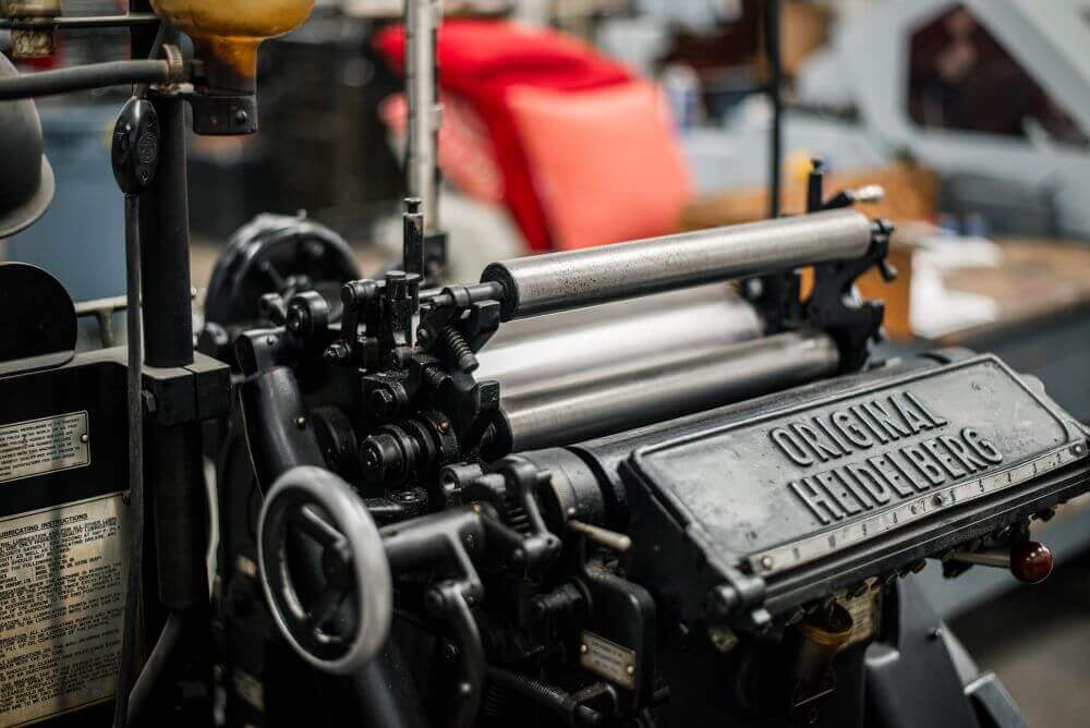
In today’s world, the journey of graphic design doesn’t end on a screen—it comes to life in the physical realm. Whether it’s a banner, brochure, or branded merch, taking a design from digital to print requires careful planning and expertise. The success of any printed piece lies in bridging the gap between digital design and the technical realities of print, making a seamless transition crucial. That’s where tpc steps in, providing both creative and technical expertise under one roof to guarantee every project is handled with precision from start to finish.
The Importance of Proper File Setup
Getting a design print-ready involves more than just hitting ‘print.’ Proper file setup is essential to ensure quality and accuracy in the final product.
- Resolution and DPI: When working with digital media, lower resolutions are often sufficient. But for print, a higher resolution—measured in DPI (dots per inch)—is necessary to achieve crisp, clear images. Generally, 300 DPI is the standard for print, whereas digital screens can make do with 72 DPI. Without the correct resolution, prints can appear pixelated or blurry.
- File Formats for Print: Certain file formats are better suited for high-quality printing. While JPGs and PNGs work well for digital purposes, vector-based formats like AI, EPS, and SVG allow for scaling without loss of quality, making them ideal for print projects (including large format and vehicle graphics). Having the right format ensures designs are sharp no matter the size.
- Color Modes – RGB vs. CMYK: Digital designs are created in RGB (Red, Green, Blue) color mode, which is optimal for screens. However, printing requires CMYK (Cyan, Magenta, Yellow, Black) for accurate color reproduction. Without converting to CMYK, the colors in your print may not match what’s seen on the screen. Understanding and adjusting to these differences is crucial for vibrant, true-to-design results.
Understanding Print Materials and Methods
The choice of material can dramatically impact the look and feel of a printed piece.
- Paper Types and Their Impact on Design: Coated paper offers a smooth finish and enhances color vibrancy, while uncoated paper adds a natural, textured feel. Then there’s the choice between matte and gloss finishes, both of which give entirely different looks to a printed design. Thickness also plays a role—heavier papers offer a premium feel, while lighter papers are more suited for budget-friendly projects. Additionally, there’s cover vs. text paper: cover stock is thicker and sturdier, perfect for business cards or postcards, while text paper is lighter and more flexible, ideal for brochures and flyers. Selecting the right combination can significantly enhance the final look and feel of a project.
- Printing Methods: Choosing the right printing method depends on the project’s scope and goals. Digital printing is ideal for small runs and quick turnarounds, while offset printing (which is done on a press) provides exceptional quality and is more cost-effective for large quantities. Offset printing also allows for the use of Pantone Matching System (PMS) colors, providing precise color consistency across various materials. Screen printing, often used for apparel and certain promotional items, is great for bold, solid colors and can also incorporate PMS for brand accuracy.
When it comes to materials, tpc offers a variety of options to ensure every project is tailored to its unique needs, producing the perfect outcome.
The Role of Color Management in Print
Achieving color accuracy across printed pieces is an art form in itself.
- Ensuring Color Accuracy: The Pantone Matching System (PMS) is a standardized color reproduction system that helps ensure consistency across different materials and print runs. At tpc, our press operator meticulously hand mixes pantone colors. A strong printer will use PMS colors or a near-exact match when printing digitally in full color. The type of press, whether digital or offset, can also influence the outcome. Leveraging advanced color management techniques maintains brand integrity and consistency.
- Color Proofing: Before going to print, proofing is essential. This step ensures that the final colors align with the intended design, giving an opportunity to make any necessary adjustments. tpc guides clients through this critical process to avoid surprises when the final product arrives.
Bleeds, Margins, and Safe Zones
These elements ensure that the design remains intact during the printing process.
- Why These Matter in Print Design: Bleeds allow designs to extend beyond the trim edge, preventing unintended white borders. Margins give space for important text and graphics, while safe zones ensure that no critical design elements are cut off during the trimming process. Without proper attention to these details, a beautiful design can quickly turn into a print disaster.
Special Finishing Techniques
Adding a special touch can elevate any printed piece.
- Embossing, Debossing, and Foil Stamping: These tactile effects provide a luxurious feel, turning ordinary materials into eye-catching pieces. Embossing raises elements off the surface, while debossing presses them in. Foil stamping adds a metallic sheen that shines under the light.
- Custom Cutting and Die-Cuts: Uniquely shaped designs stand out from the crowd. From business cards to packaging, die-cuts can transform the standard rectangle into something memorable.
There are a wide array of finishing options, allowing businesses to get creative with their printed materials and make a lasting impression.
Kitting & Fulfillment Services for Branded Materials
When managing large-scale projects, it’s important to think beyond individual prints.
- Creating Cohesive Kits: Branded kits are an excellent way to present a company’s story, whether it’s for new hires, clients, or special events. By combining various printed materials—like brochures, apparel, and other promo items—into a cohesive kit, businesses can leave a powerful impression.
- End-to-End Solution: tpc handles everything from design to print to fulfillment, making large-scale kitting projects a breeze. No need to worry about juggling multiple vendors.
Consistency Across Multiple Platforms
Maintaining a cohesive brand identity requires careful attention to detail in both digital and print.
- Consistent Branding Across Digital and Print: Consistency is key, whether it’s a logo, a tagline, or specific brand colors. Branding should feel seamless across websites, social media, merchandise, signage, and printed materials. When all pieces align, businesses can maintain a strong, unified brand.
tpc manages both the digital and physical aspects of branding. From print and apparel, to large-scale signage, tpc promotes consistency across all mediums.
Conclusion
Translating a design from digital to physical is a process that requires precision, technical know-how, and creativity. With over 30 years of experience, tpc is the trusted partner businesses rely on when bringing their designs to life. From concept to execution, we are your single-source partner who makes sure the process is smooth, stress-free, and successful every step of the way.
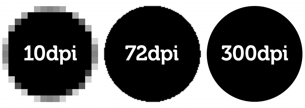
DPI Differences (Cred: Duggal Visual Solutions)
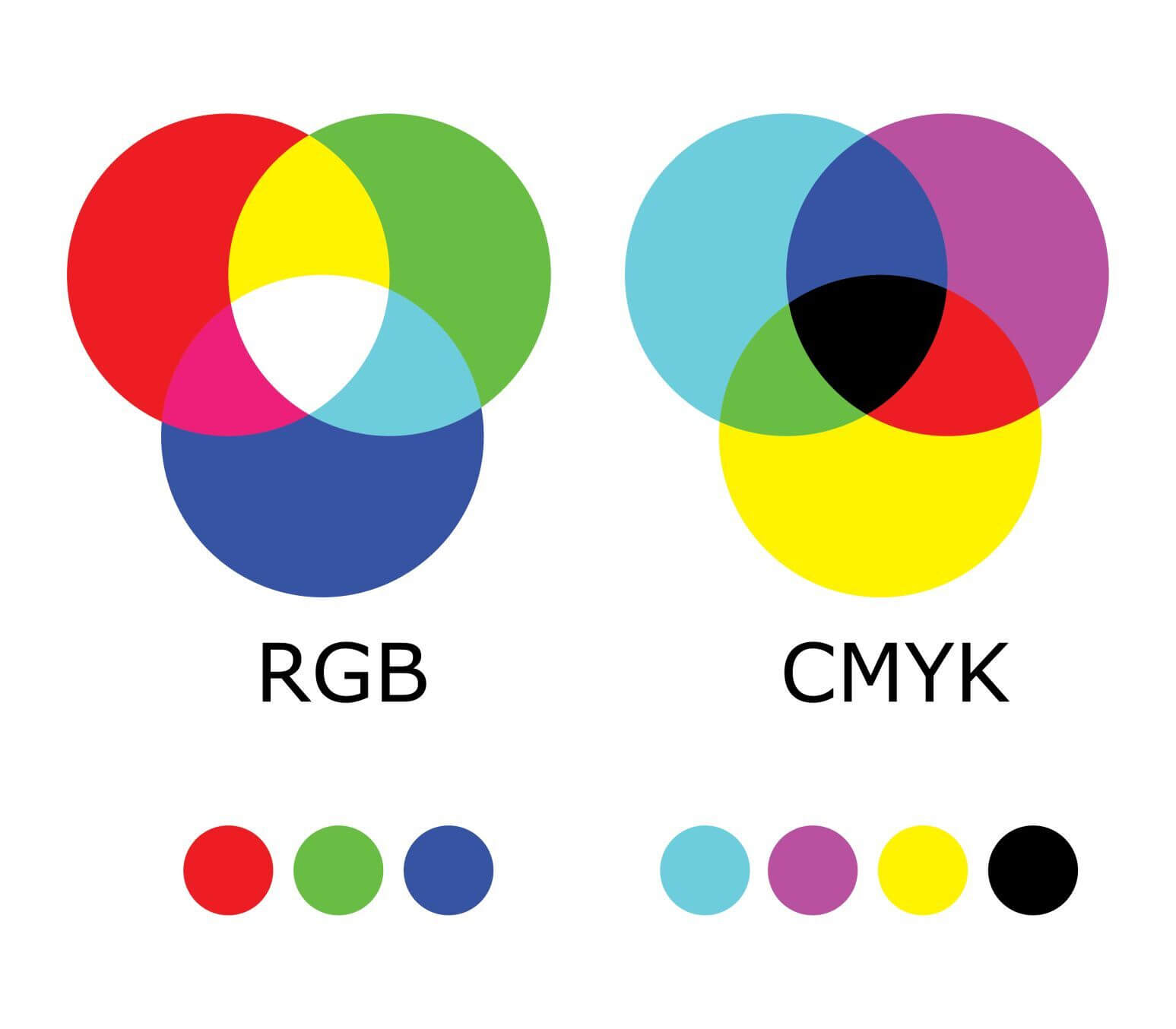
RGB vs CMYK (Cred: CW Creative)
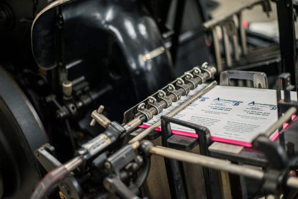
Printing Press
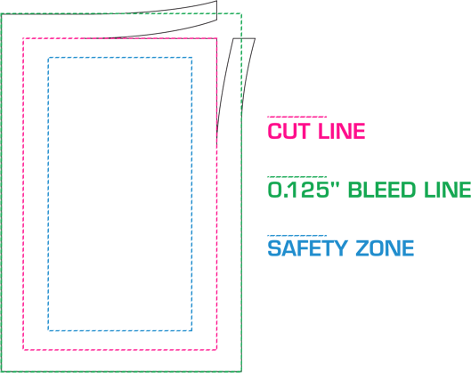
Bleeds, Margins, and Safe Zones (Cred: Select Graphics and Printing)
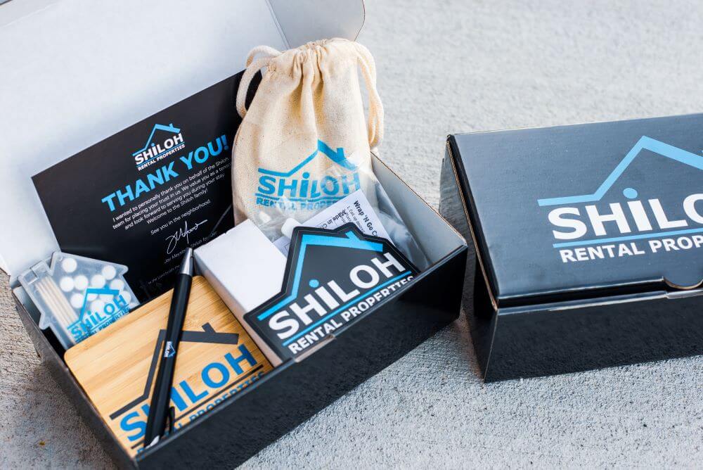
Kitting Example
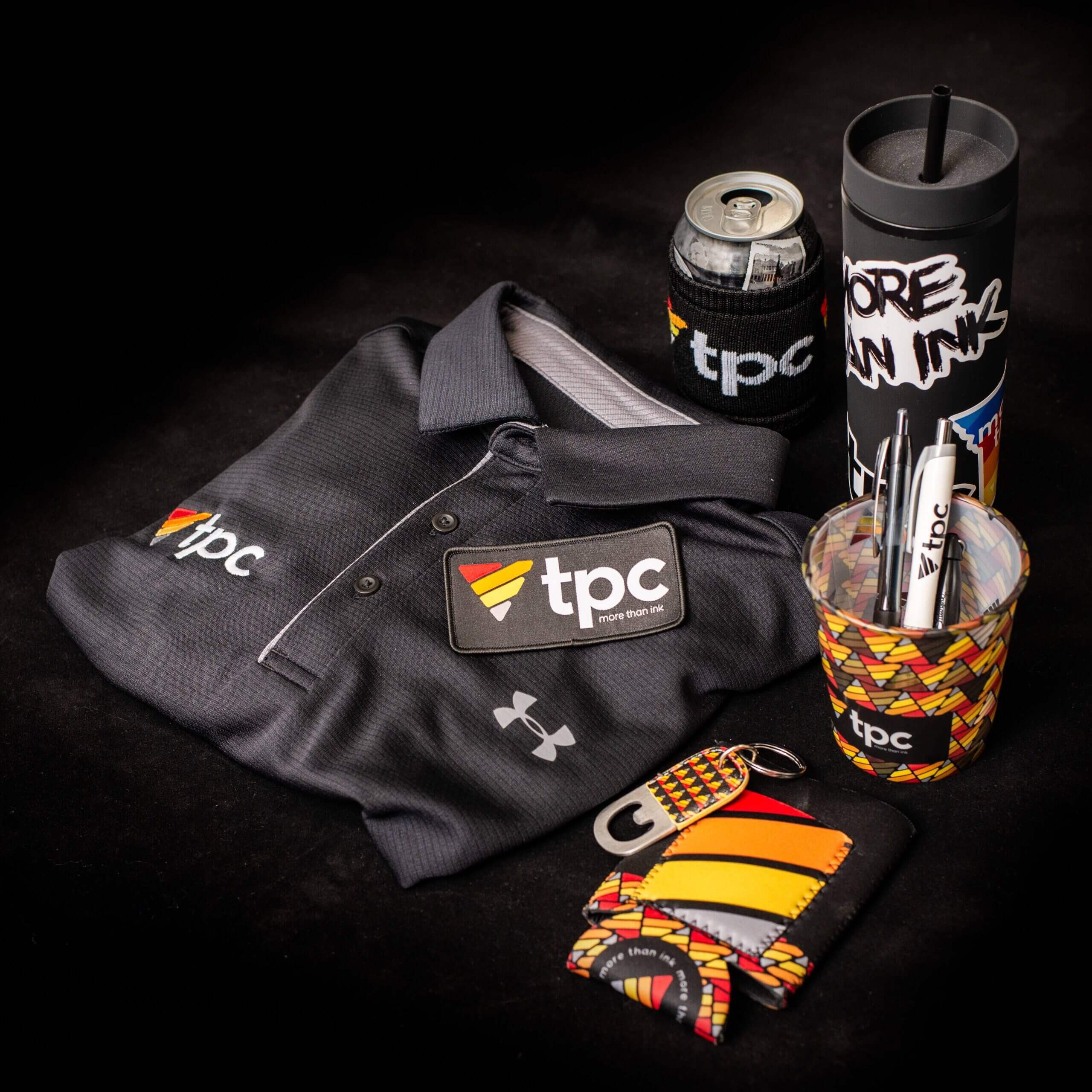
Consistent Merch and Apparel Branding


