Welcome to the world of vehicle wrap design, where creativity meets practicality, and a brand’s message takes center stage on the road. A stunning vehicle wrap not only grabs attention but also effectively communicates brand identity. Join us by exploring the do’s and don’ts of vehicle wrap design, revealing secrets to creating eye-catching mobile advertisements that leave a lasting impression.
The Do's of Wrap Design
Understanding the Purpose
Before diving into the design process, it’s crucial to understand the purpose of a vehicle wrap. According to Avery Dennison, wrapping a vehicle gives that brand “the opportunity to promote a product or service via a mobile billboard that can generate more than 100 impressions per mile”¹. 3M says it is also a great way to “Boost brand awareness and reflect your style”². Is the aim to increase brand awareness, promote a specific product or service, or simply stand out from the crowd? Clarifying personal objectives will guide designers in the correct direction and ensure that every element serves a strategic purpose.
Keep It Simple
In the world of vehicle wraps, less is more. It may be tempting to want lots of info (contact email, address, phone number, website, QR codes, etc.) and complex graphics, but those should be avoided. Instead, opt for clean, simple layouts that allow the message and a single contact route to shine through clearly. Remember, there are only a few seconds to capture the attention of passersby, so make every second count. Simplicity is engaging, as demonstrated by this design for Tipton Linen. It’s straightforward and clean, yet tpc designers made it remarkably captivating.
Prioritize Readability
One of the most common pitfalls in vehicle graphic design is sacrificing readability for visual creativity. While it’s important to showcase a brand’s personality, readability should always remain the top priority. Choosing fonts and colors that are easy to read from a distance ensures that important information such as contact details or key messaging is prominently displayed. A great trick to check for readability is putting the wrap in greyscale during the design process. If it’s difficult to read, then the fonts, colors, or design is clashing. Consider our surf van as an example: we crafted a highly creative and captivating wrap while ensuring it’s easily readable.
Utilize High-Quality Images
Quality matters when it comes to vehicle graphic design. It’s crucial to use high-resolution images and graphics (vector images, .svg, .eps, .ai) that are crisp and clear, even when viewed up close. Blurry or pixelated graphics (raster images, .png, .jpeg, .gif) can detract from the overall professionalism of the wrap and leave a detrimental brand impression.
Consistency is Key
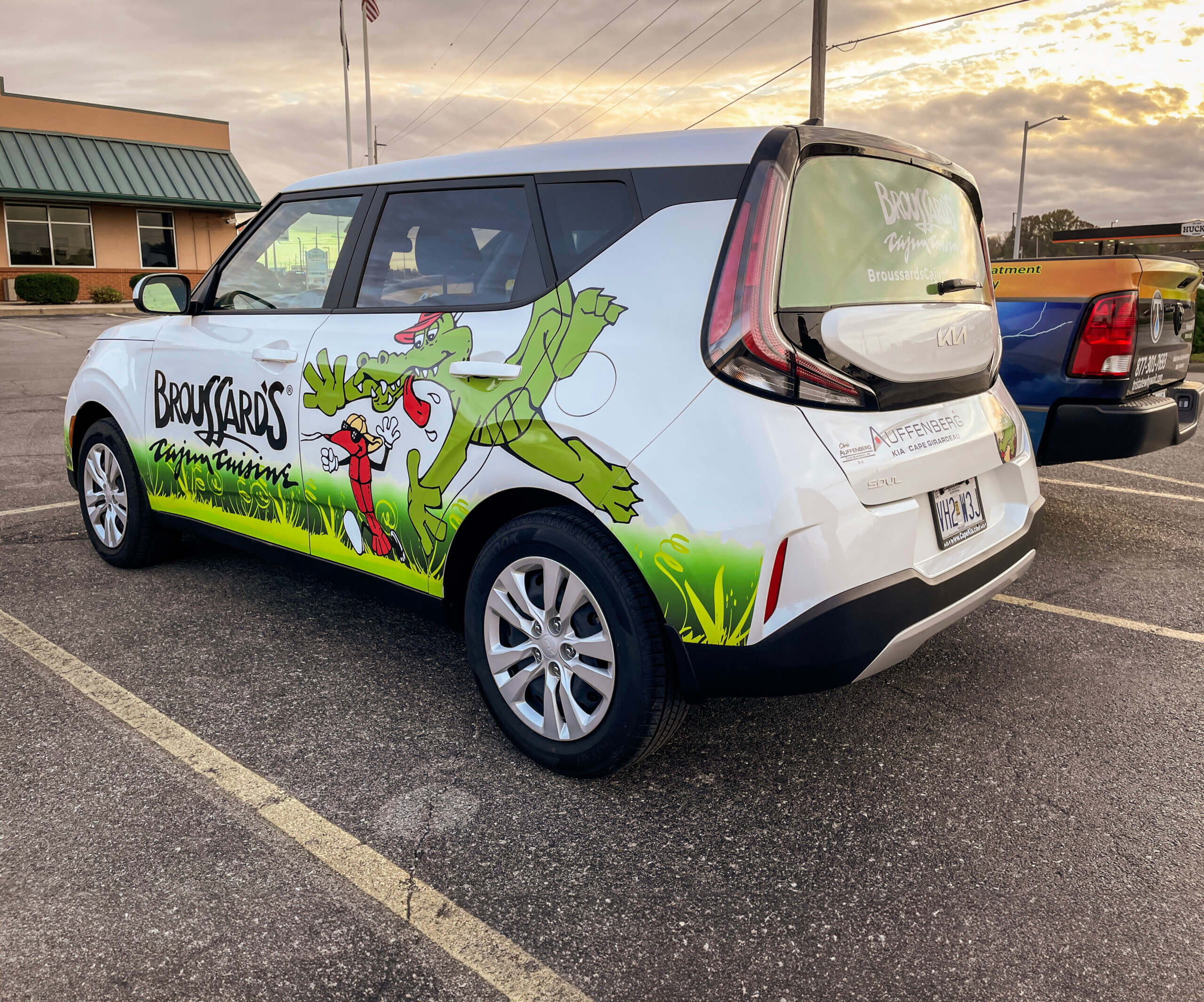
Consistency is key when it comes to branding, and a vehicle wrap should be no different. Ensuring that a wrap aligns with the brand’s existing visual identity, including brand colors, fonts, and logos is key. A cohesive design reinforces brand recognition and enhances credibility. tpc designers make sure every element matches by talking with the client and researching the brand. The vehicle wrap design below for Broussard’s Cajun Cuisine maintains brand consistency by adhering to established standards and effortlessly reflects the brand’s image.
The Don'ts of Wrap Design
Avoid Clutter and Overcrowding
Overcrowding a design with text, graphics, or visuals overwhelms viewers and dilutes the message. Instead, aim for a clean layout that emphasizes key information, like services/products provided and a phone number. A vehicle wrap is essentially a moving billboard, so clarity and simplicity are the key to ensuring that the message is noticed and remembered.
Steer Clear of Overly Complex Designs
It’s important to strike a balance between creativity and practicality. Overly complex designs can be difficult to decipher, especially when viewed from a distance or at high speeds. They also increase installation costs. Designers generally opt for bold, eye-catching visuals that convey the message quickly and effectively. Simplicity is the key to making a memorable impression.
Don’t Forget to Consider Practicality
It’s important for vehicle graphics to be practical and functional. Considering factors such as the vehicle’s shape, size, and surface texture ensures that important information like websites or key messages are placed in visible, easily accessible areas. Additionally, durability and longevity of wrap materials allow them to withstand the rigors of everyday use. By balancing aesthetics with practicality, tpc can create a vehicle wrap that not only looks great but also delivers results.
Common Mistakes to Avoid
There are several common mistakes that should be avoided at all costs. These include ignoring the vehicle’s contours, neglecting proper measurement, underestimating color choice, and forgetting about maintenance. Ignoring vehicle contours and measurements means the wrap may not install correctly. Bad color choices can lead to readability issues. And of course once the wrap is installed, it is important to maintain or it won’t hold up as well over time. Not keeping it clean can lead to staining or always leaving it in the sun may effect the colors. By steering clear of these pitfalls, one can ensure that the vehicle wrap looks great.
Example of Effective Designs
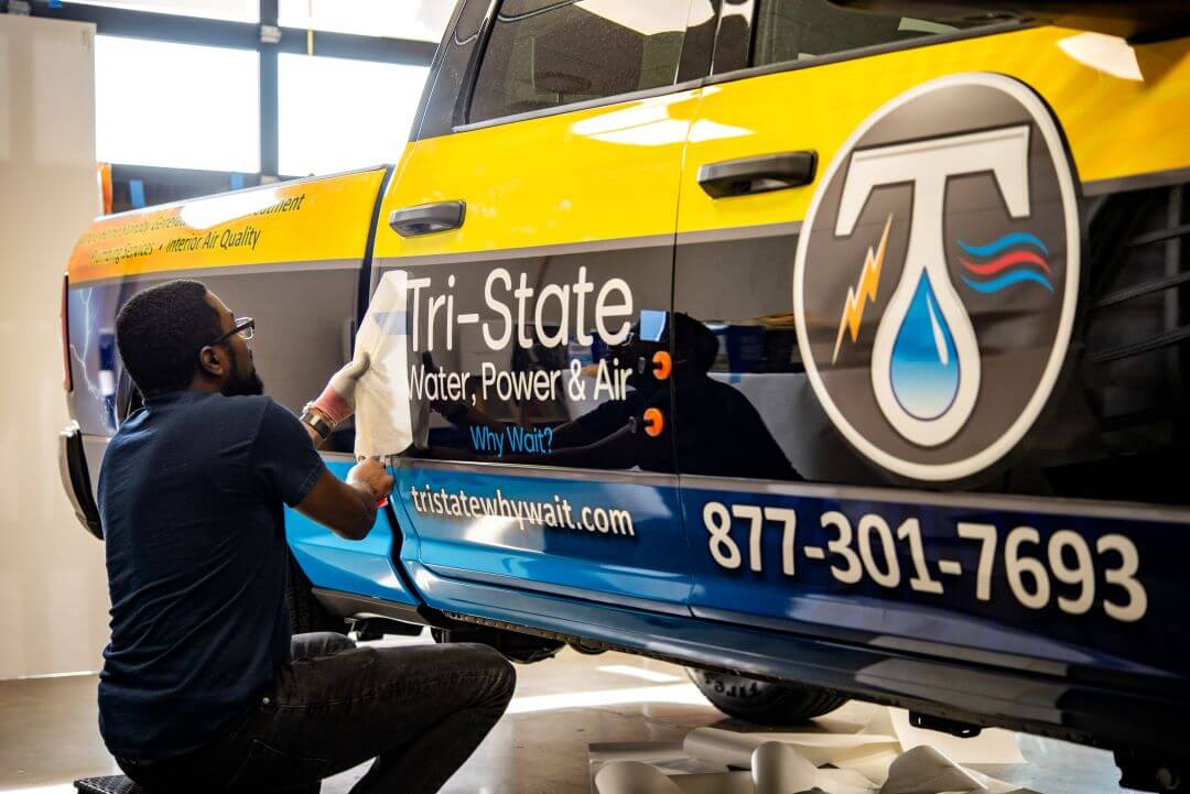
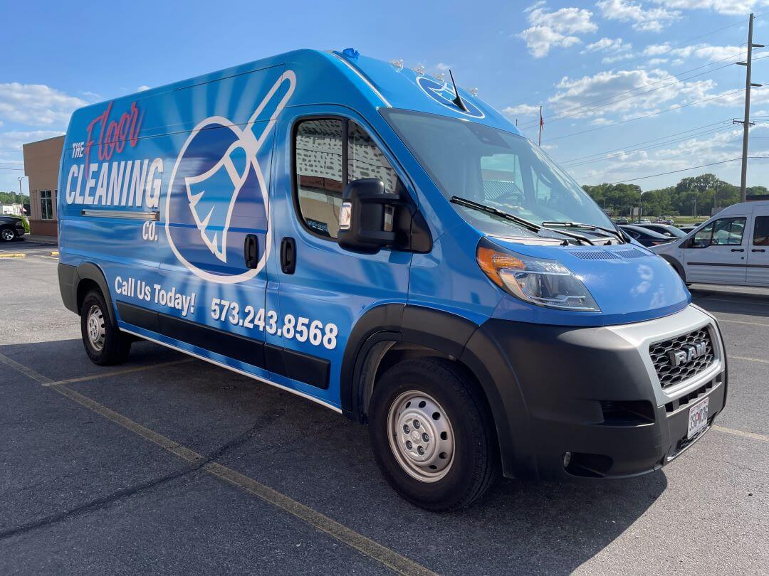
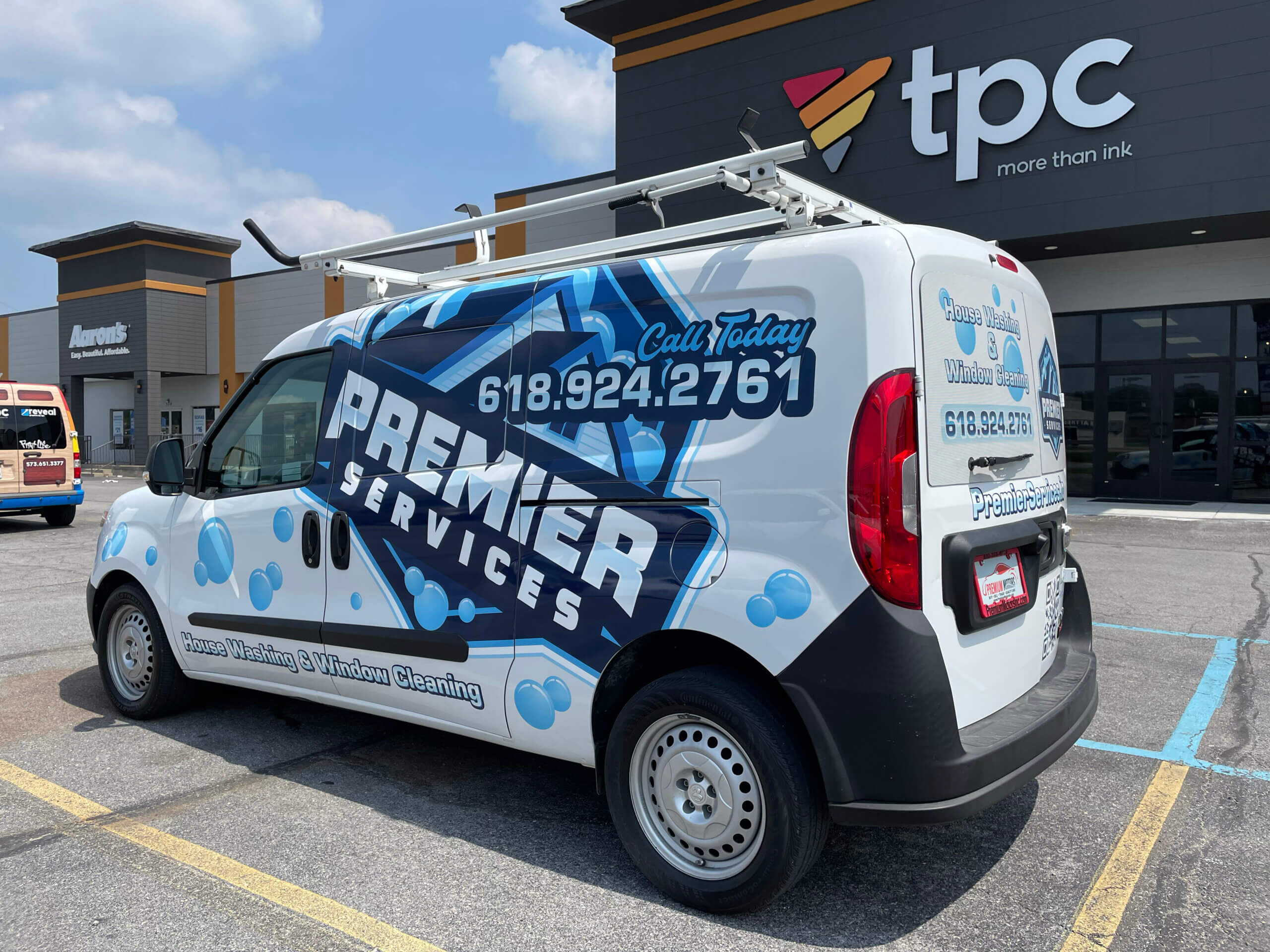
Effective vehicle wrap designs utilize brand imagery, vibrant colors, and visual reminders to create a compelling identity. Tri-State’s wrap prominently features their logo and effectively communicates their mission. The Cleaning Co. uses bold, eye-catching colors that reflect their brand’s freshness, ensuring high visibility and instant recognition. Premier Services’ wrap is simple; utilizing already established imagery while maintaining their color palette and text. These examples demonstrate how strategic design elements can transform vehicle wraps into powerful marketing tools.
Advantages of Partnering with tpc
When it comes to vehicle wrap design and printing, partnering with tpc offers numerous advantages. With years of experience in the industry, our team of graphic design experts bring visions to life. We deliver high-quality design and printing services, as well as an exceptional customer experience. Whether someone is looking to transform a single vehicle or an entire fleet, tpc can be trusted to deliver with our graphic design services.
Mastering the art of vehicle wrap design requires a careful balance of creativity, practicality, and attention to detail. By following the do’s and don’ts outlined in this guide, you can create stunning vehicle wraps. And when you partner with tpc, you can rest assured knowing that your vehicle wrap is in expert hands; because we’re more than just a design and printing company. Let’s turn your vision into reality and unleash your brand’s potential on the road. Contact us today to transform your vehicle into a mobile masterpiece.
(1)Transportation. Transportation | Avery Dennison. (n.d.).
(2)Graphics & Signage. 3M in the United States. (n.d.-a).
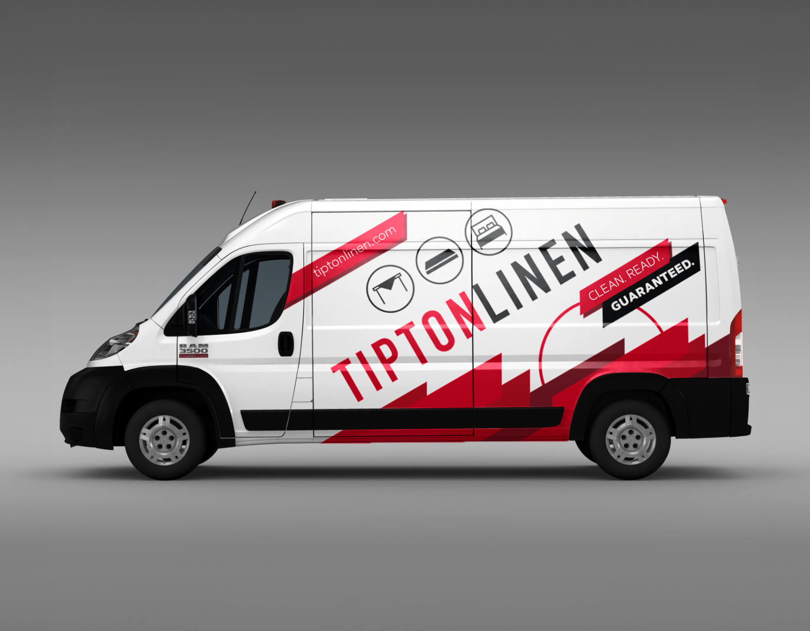
TIPTON LINEN WRAP
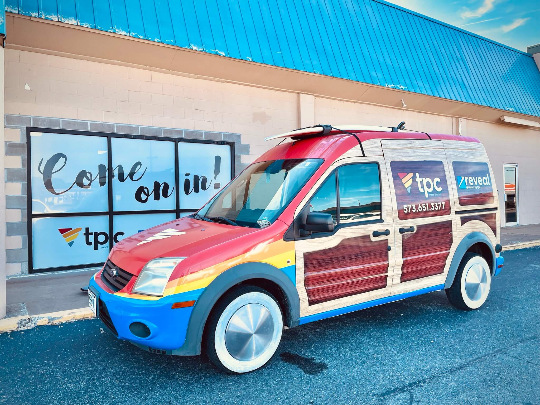
REVEAL SURF VAN
