Typography plays a crucial role in print design, affecting both how easy something is to read and how well it aligns with the brand’s image. When selecting fonts for printed materials, it’s important to strike a balance between style and function. Typography goes beyond aesthetics—it helps communicate the right message while ensuring consistency across all printed projects.
Understanding the Basics: Serif vs. Sans-Serif Fonts
One of the most fundamental choices in typography is deciding between serif and sans-serif fonts. Serif fonts, known for their decorative strokes at the ends of each letter, are often used for formal, traditional pieces like books, invitations, or business cards. Their fine details guide the reader’s eye across longer text, making them a strong choice for projects requiring lots of reading. On the other hand, sans-serif fonts, which are clean and modern, are ideal for larger print materials like posters or signage. Their bold, simple structure allows for easy reading from a distance and creates a more contemporary feel. When choosing between the two, consider the tone and purpose of the printed piece.
Legibility Matters: Font Size and Spacing
A frequent challenge in print design is ensuring that fonts remain legible once transferred from a digital screen to physical paper. Fonts that are too small or too closely spaced can be difficult to read, especially for longer sections of text. For print, it’s usually best to stick to font sizes of at least 12 points for body text, and make sure there’s enough space between lines to give the text room to breathe. Adjusting the spacing between lines and letters is also essential for improving readability. Testing fonts by printing out samples is always a good idea before finalizing a design.
Print vs. Digital Fonts: The Differences
While many fonts look great on screen, they may not hold up as well in print due to the difference in resolution and texture. Print fonts are designed specifically with the physical medium in mind, accounting for factors like ink spread and paper texture. Using a font optimized for digital use may lead to blurry or unclear text on printed materials. Selecting fonts that are made for print ensures that the design will be crisp and easy to read, no matter what material it’s printed on.
Choosing Fonts That Align with Your Brand
Consistency is key when it comes to typography and branding. The fonts used in printed materials should complement the ones already chosen for the brand’s digital presence. Consistency across all platforms helps build brand recognition and trust. For instance, if a business uses a specific font on its website or social media, using the same font on printed brochures or business cards will strengthen its visual identity. It’s best to choose fonts that reflect a brand’s personality and avoid trendy fonts that may not age well.
Hierarchy and Contrast: Creating Visual Interest
In typography, creating a visual hierarchy is essential for guiding readers through printed content. Larger, bolder fonts draw attention to important headlines or key messages, while simpler fonts keep the body text easy to read. By using different font sizes, weights, and styles, a clear structure that leads the reader through the design naturally is established. Additionally, making sure there’s enough contrast between chosen fonts helps key information stand out.
Font Pairing: Getting the Balance Right
It’s tempting to use several fonts to create variety, but using too many fonts in a single design can quickly make it feel cluttered. It’s best to stay limited to two or three fonts that complement each other well. Typically, a good approach is to use one font for headings and another for body text. Pairing serif fonts with sans-serif fonts can create a nice contrast that keeps the design balanced while also providing variety. Keeping the number of fonts low helps the design remain clean and professional.
Accessibility in Typography: Making Sure Everyone Can Read It
When choosing fonts, it’s important to consider how accessible they are for all audiences, including those with visual impairments. Overly decorative fonts or fonts with thin strokes may be difficult for some readers to see clearly, especially in poor lighting conditions or on textured paper. Choosing fonts with strong contrast, appropriate sizing, and clear, straightforward designs helps ensure the materials are readable by everyone. Accessibility is a critical aspect of typography that shouldn’t be overlooked.
Font Licensing: Understanding the Legal Side
Another important consideration in typography is ensuring the correct licenses for the fonts being used. Many fonts are not free for commercial use, so it’s essential to verify their licensing terms before including them in a print project. Choosing licensed or free-to-use fonts from reputable sources helps avoid potential legal issues and ensures compliance with commercial usage regulations.
Conclusion
Choosing the right typography for print is about finding the perfect balance between readability and style. Typography not only influences the look of printed materials but also impacts how well the message is understood by the audience. At tpc, we’re experts in helping clients select the ideal fonts for their projects, ensuring that every printed piece is polished, professional, and aligned with brand identity. For businesses that haven’t yet chosen fonts, we also offer brand standard services, including selecting logos, fonts, colors, and more. With the right typography, printed materials will not only look great but also effectively communicate the message.
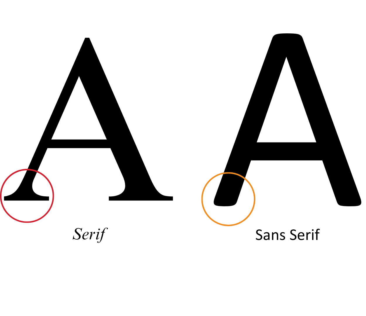
Serif vs. Sans Serif Font
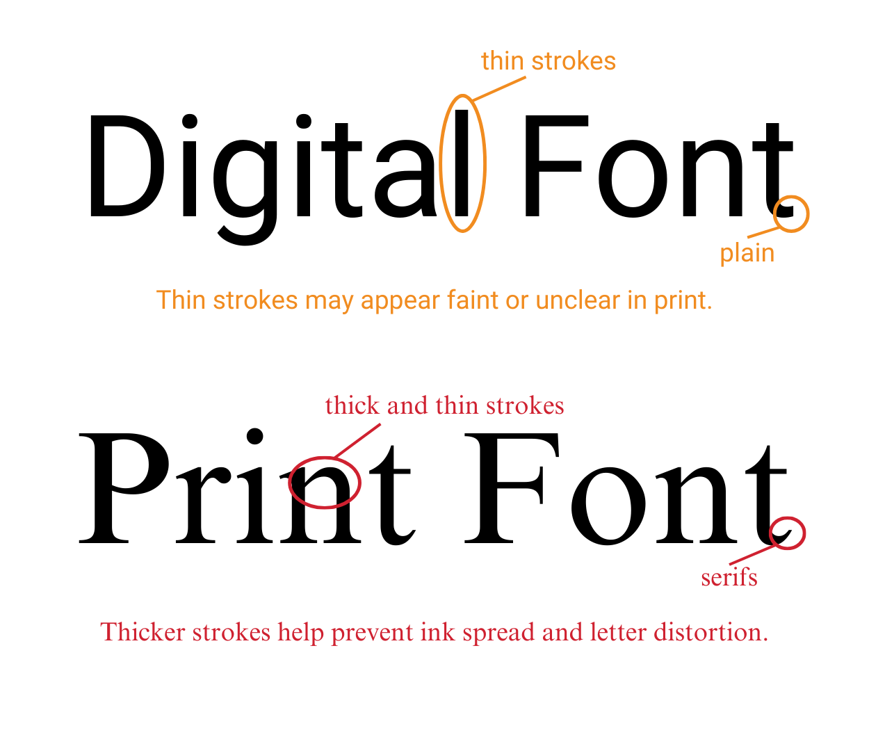
Digital Optimized vs. Print Optimized Font
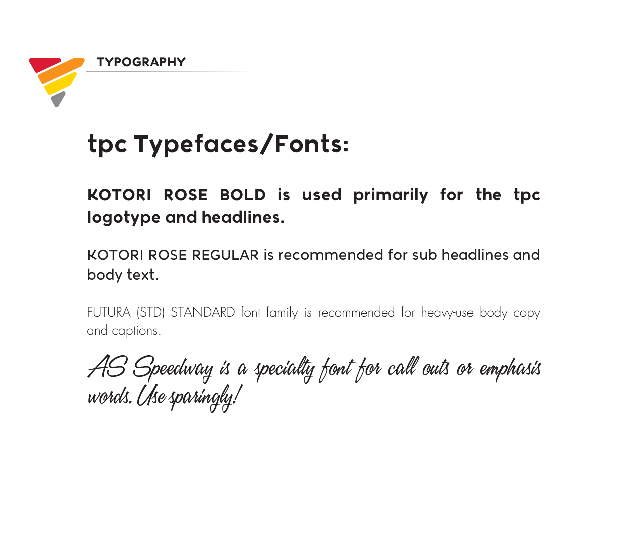
Brand Guideline Example (Consistency is Key!)
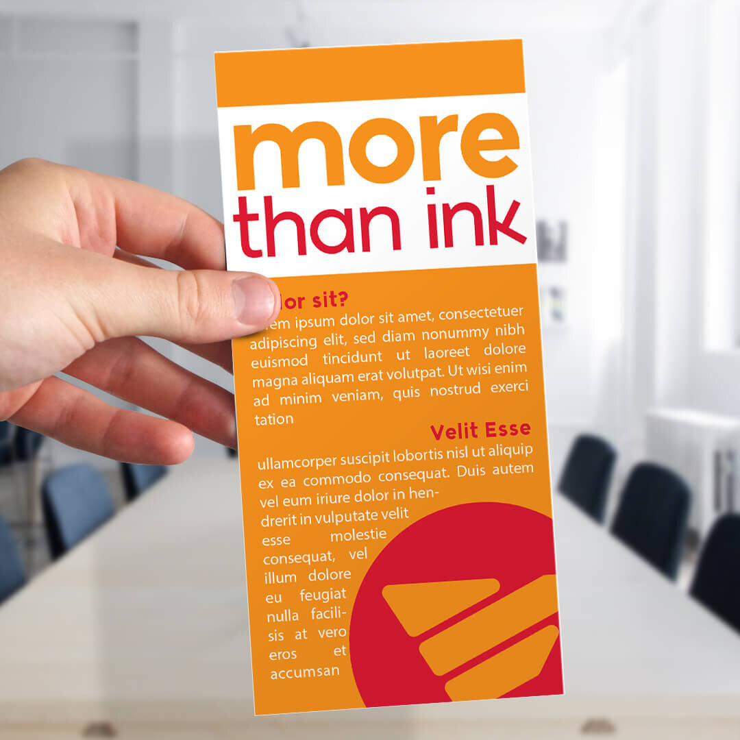
Print Product (Rack Card)


